



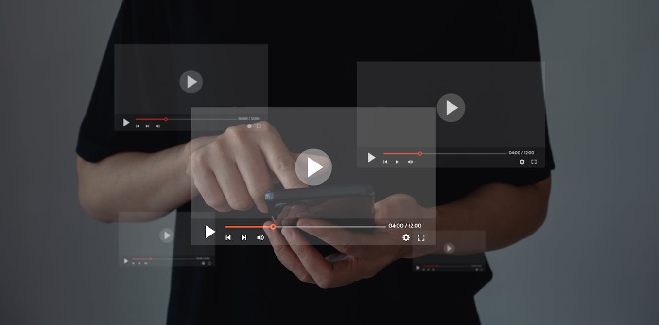
The play symbol is one of the world’s most recognisable icons. Across languages, writing systems, and cultures, a single right-pointing triangle is widely understood as “start”.
Yet there’s nothing about this simple geometric icon that inherently suggests the start of something. So why does it carry this meaning?
The emergence of such universal media symbols is relatively recent in design history.
An early case study
From the 1960s, consumer audio and video technologies became internationally widespread. In 1963, the Philips EL3300 was the first mass market recorder for the brand-new medium of compact cassettes.
It featured a single button that slid left, right and up to control playback. These directions were indicated by the double-arrow rewind and fast-forward symbols, and the single arrow play symbol, respectively.
However, in this early device, the play symbol points upward, to indicate the direction the button must be moved to activate the device’s play feature.

Wikidata, CC BY
Direction of play: left to right
Rather than being the creation of a single company or designer, the play button as we know it now emerged from a range of firms producing specialist and consumer recording equipment throughout the 1960s, including Ampex, Philips, Norelco, Grundig and Sony. These early products included a range of icons and text labels for various functions.
The play icon was among the earliest to be used. The Sony TC-100 cassette recorder, released in 1968, is one of the first devices to fully eliminate textual labels in favour of the media icons we recognise today. Notably, the TC-100 includes a right-pointing triangle for “play”.
So why does this play icon point right? On early magnetic tape recorders, tape was transported between two reels. The reel on the left side of a device contained the fresh tape. Pressing the play button caused the reels to spin, which passed the tape from the left reel through the play head, before it accumulated on the right reel.
When compact cassettes were introduced, they followed this same pattern. Thus, the play button became associated with the direction the tape moved while “playing”.
By the late 1960s, cassette recorders had spread from Europe to the United States and Japan, and manufacturers faced the problem of how to design controls that were understandable across languages and alphabets.
Preferring simple and unambiguous signs, the International Organization for Standardization (ISO) and International Electrotechnical Commission (IEC) converged on the right-pointing triangle as the standard play symbol. While the records for who used this icon first are hazy, the Sony TC-100 is a likely candidate.
Read more:
Curious Kids: how does music get onto a cassette tape?
Back to the future
The rewind and fast-forward symbols standardised by the ISO and IEC build on this same basic directional cue. Where a single triangle suggests progression at normal speed, doubled triangles indicate increased urgency in the pointed direction.
These conventions were originally applied to the transport controls – the buttons affecting the direction of tape movement – in analogue audio and film systems. But as more devices emerged in the 1970s and 1980s, these symbols expanded across a wider ecosystem of boomboxes, VCRs, camcorders and digital media.
Stop, for a moment, and for good
The square shape of the stop symbol is graphically distinct from “play”. With four corners, instead of three, no direction is indicated.
In his book Signs and Symbols: Their Design and Meaning, renowned typeface designer Adrian Frutiger notes the shape of a square is associated with stability and closure, which metaphorically aligns with the cessation of an activity.
Similarly, the pause can be thought of as a temporary halt. While the exact origins of the pause symbol are hard to pin down, the parallel bars are reminiscent of the “caesura” used in poetry and musical composition to represent a break in continuity.
At once universal and malleable
As media technologies shifted from mechanical systems to electronic and eventually digital ones, these symbols quickly took on new meanings. The play button in particular has transcended its button-pushing roots to become a metaphor for the start of anything, such as the wash cycle on your washing machine.
This symbolism has even been leveraged across brands and marketing campaigns. In New Zealand, the Hillary Commission promoted its Push Play campaign throughout the 1990s and 2000s to get young Kiwis more physically active. And in 2019, the Ireland-based Barretstown Children’s Charity launched its We Press Play on Childhood initiative to help seriously ill children participate in “normal” childhood experiences at a specialised camp.
We find similar uses with other media symbols.
In 2022, the sports drink Powerade launched its Pause Is Power campaign to challenge the win-at-all-costs mentality in sports. And last year, the Washington Metropolitan Area Transit Authority launched 25 Metro Rewind, a year-in-review campaign aimed at increasing Metro usage by encouraging riders to revisit their travel history.
From Tokyo, to Muscat, to Palmerston North, isn’t it handy that you’ll always know which button to press to clean your clothes, start your favourite song, or change the channel on TV?


